
")
ALBAWABA- Since its introduction decades ago, logos have undergone a significant change in design. Whereas they used to be heavily detailed, organizations now aim for a more minimalistic approach.
A Logo is a design symbol brands use to differentiate themselves from one another. Without a logo, the brand would lose its identity, like a person's name.
1) Google Chrome (2008 vs 2022)
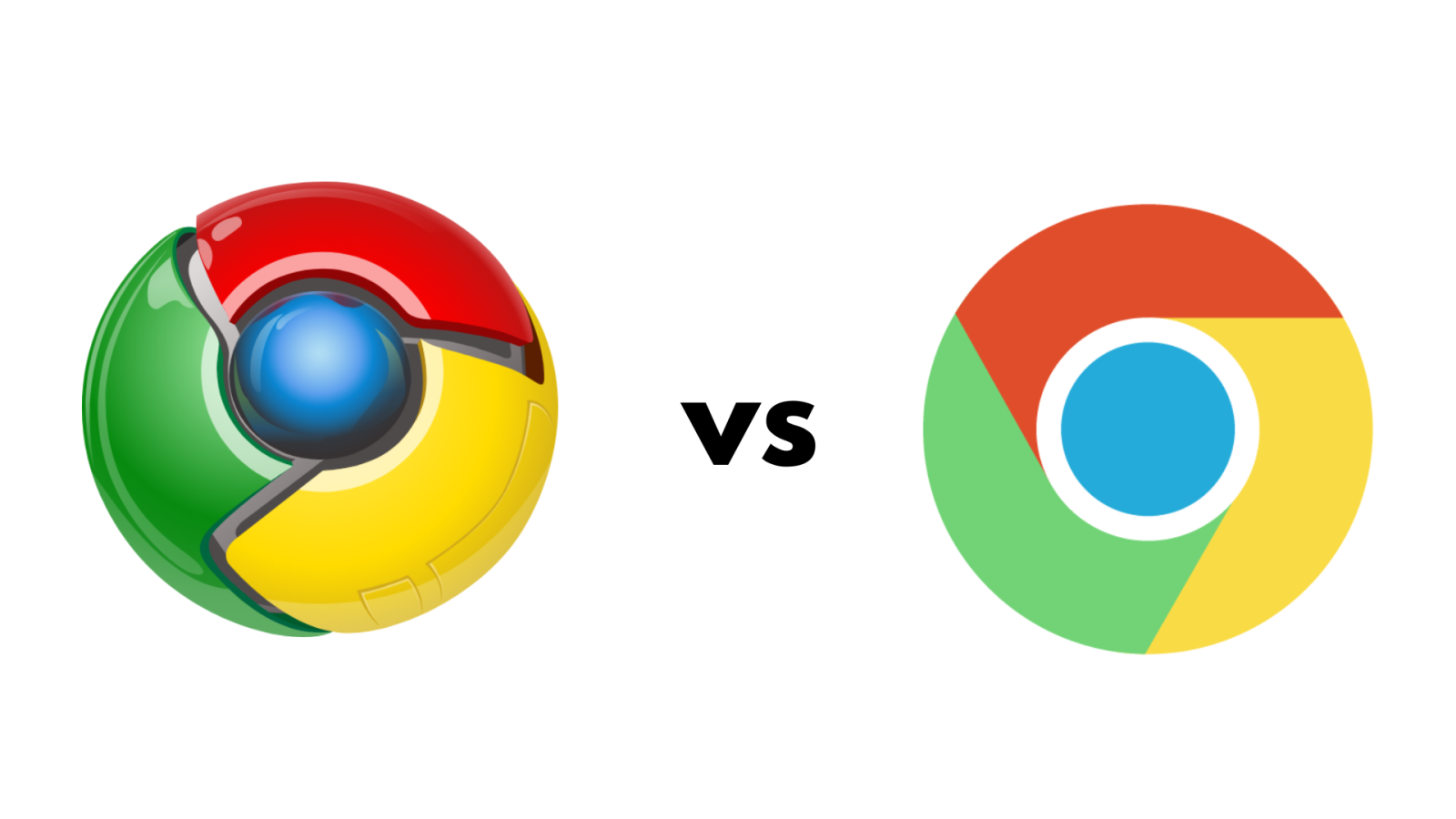
Like many other brands nowadays, Google's browser has seen quite a change from 2008 to 2022.
Google took a more simplistic and flat approach to the iconic wheel with its 2022 version by getting rid of the highlights, shadows, and 3D look of its 2008 predecessor.
2) Twitter, also known as ''X'' (2012 vs 2023)
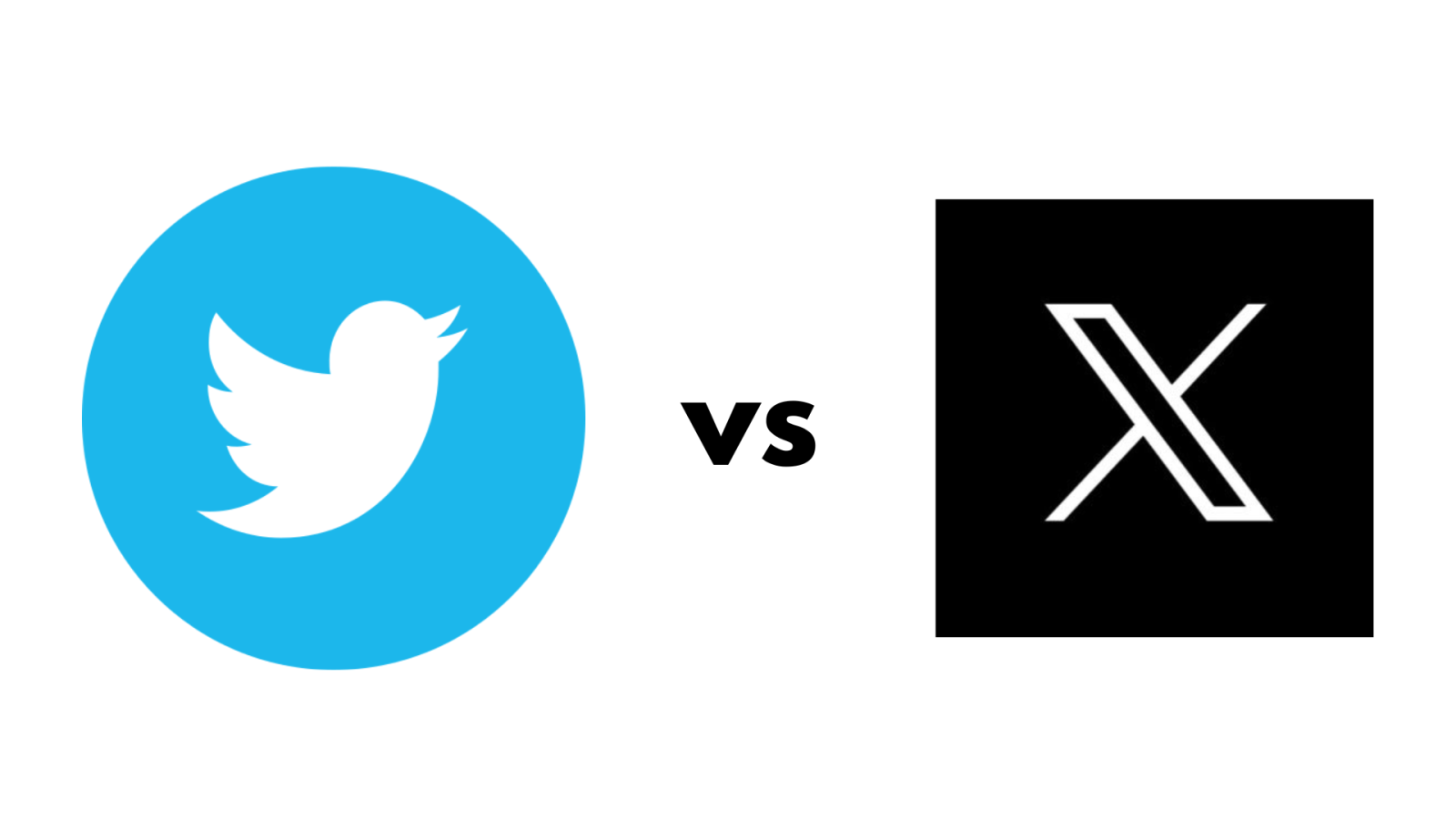
Twitter's CEO Elon Musk has recently announced the rebranding of Twitter with the letter "X''.
Musk is taking a futuristic approach with X's logo by using a minimalist custom font and going black and white instead of Twitter's blue and white.
3) Pringles (2009 vs 2021)
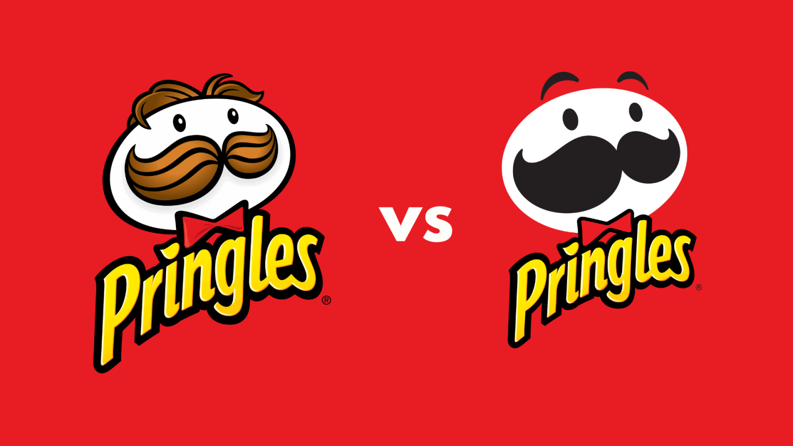
The iconic Julius Pringle lost his hair and grew eyebrows with the 2021 version. Additionally, Julius looks more minimalistic now with no outline and details.
His hair and moustache were detailed and brown but his colour palette changed to a flat black in 2021.
4) Pepsi-Cola (1898 vs 2023)
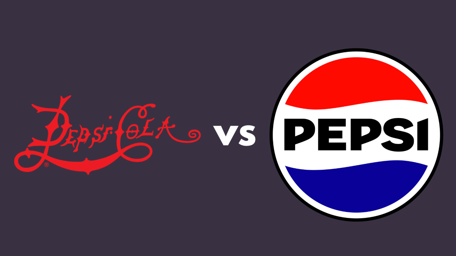
Pepsi- Cola has seen a drastic change in design from 1898 till 2023 as seen above. Nowadays people cannot think of Pepsi without its iconic red, white, and blue logo.
2008's logo was not liked by many fans worldwide since Pepsi took a minimalistic approach but 2023's logo changed and incorporated old logos with a modern feel.
5) Apple (1976 vs 1998)
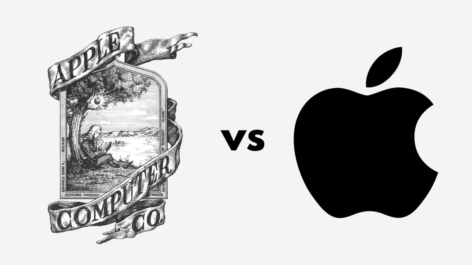
Apple has been known for its iconic bitten fruit logo for a long time but not many people knew its origins.
Apple used Isaac Newton's fruit drop story for their logo inspiration in 1976. Isaac is seen sitting beneath the tree with an apple hanging from it waiting to fall.
6) Firefox (2004 vs 2019)
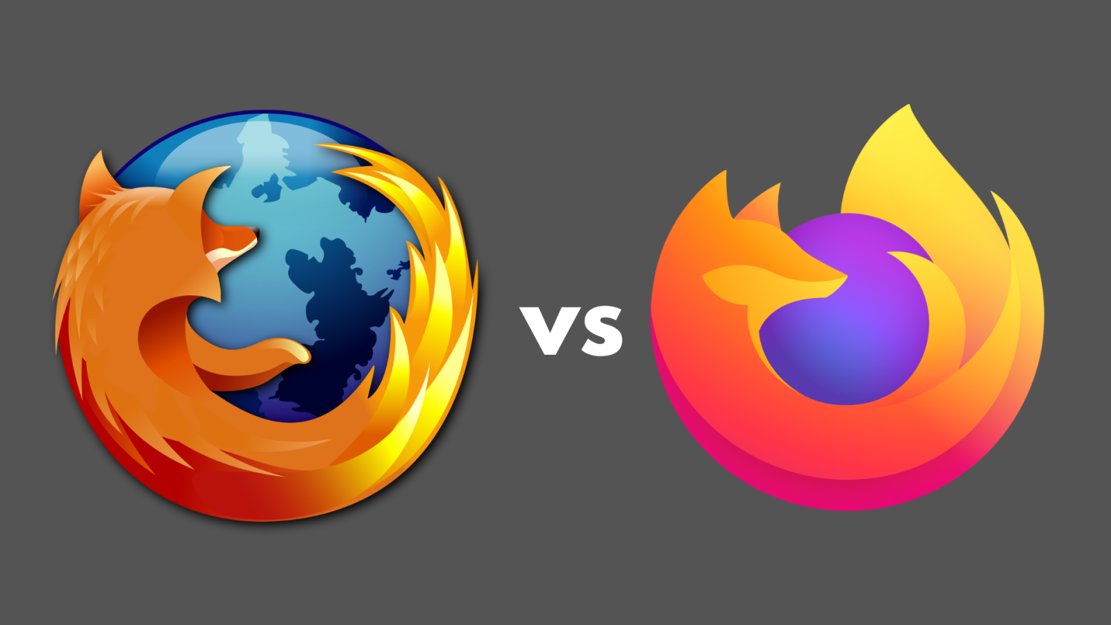
The idea of the fox hugging the earth is still there but Firefox took a minimalistic approach with its logo by making the fox and earth less detailed with a gradient.
7) Instagram ( 2011 vs 2016)
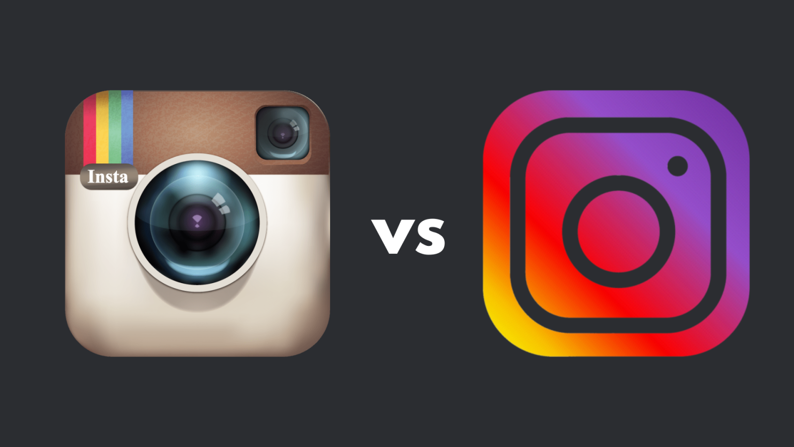
Instagram's 2016 logo took a different approach from 2011's Polaroid-inspired logo by going with a different color palette and a minimalistic look like its other social media competitors.
Do you prefer the old or new logos?

 demonstrate the entering of the German frigate \"Brandenburg\" during NATO's STEADFAST DART 26 exercise in Putlos, Germany, on February 18, 2026. AFP")


 and Iran's Foreign Minister Abbas Araghchi (R) signing documents as Iraq's Prime Minister Ali al-Zaidi (C-L) and Iran's President Masoud Pezeshkian (C-R) watch during a meeting in Tehran on July 23, 2026. AFP")
")